These are some of our ideas:
We decided to incorporate our group name within one of our designs. The colour blue also fits in with our genre of psychological thriller as it is a symbol of this genre through the use of water and mirrors.
The idea of this institutional logo is that the waves are crashing like the sea which reveals the name of the institution 'Blue Productions'.
We decided to give this as an idea as pearl and the colour pink can be shown to be precious and innocent which can be conveyed as one of the themes in our film. The clam would open up showing the two pearls with the lettering inside in a fancy writing style (which is still readable).
Moonlit productions gives and eerie feel and a sense of mystery so we decided to go with a logo based around this idea. It shows a full moon and half moon within the logo and the camera will slowly pan around the moon revealing the title as it goes. The title will twinkle as it fades out.
Drawn by Jess Foster
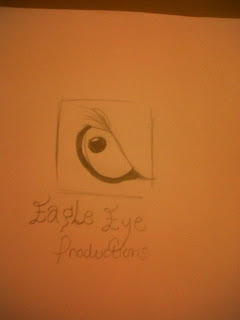
We would then need a second, motionless institutional logo for the niche market. This was one of our ideas which shows an eagle eye symbolises courage and bravery as this could be seen as the solution of our film suggesting dominance. The titling would be in a decorative writing.
Drawn, Developed & Written by Amy Welsh
Drawn, Developed & Written by Amy Welsh


No comments:
Post a Comment